Aequinox in Manhattan

Saturday, April 4th, 2009

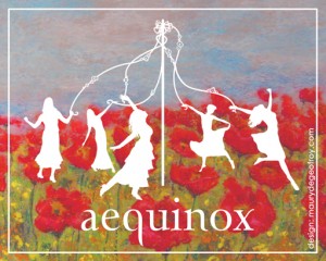
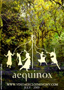
maypolefinal-smallDesign for the Aequinox advertisement at Manhattan Vintage on April 24th and 25th.

I took some hefty influence from the Silhouette Masterpiece Theatre designs, of which I recently purchased a print. The elements and juxtaposition on this particular piece are of my own doing, however, with some specific tweaks and guidance from Sarah.

If you’re in Manhattan on April 24th, stop by the show and buy some clothes. I’ll be there as well, looking out of place and very likely rather disheveled in contrast with the other attendees.

maypole-card-small

Edit: Made some modifications, and created a second image. The second was done tonight, this is for the mailing cards.

Older Work Part 9: She Considers Voyeurism

Thursday, April 2nd, 2009

binoculargirlThis is actually photoshopped. Ever so slightly. I drew this girl and I drew a pair of binoculars, they were not positioned as they are here. I saw them on the page next to each other and didn’t understand why I hadn’t drawn her looking at the binoculars. So I moved them with the power of the computer. I am a cheating hack.

There is no great story behind this image, it’s just something I drew in Savannah one day and thought there was something mysterious and interesting about it, enough to keep it around. I imagine that she is holding herself back, resisting the urge to pick up the binoculars, but she’s just about to crack and lift them to her face, and in the distance is something she knows she shouldn’t look at, something private and taboo, but she just can’t help herself.

Or birds. She could be planning to look at birds.

Older Work Part 8: Batman In Classic Art From Something Awful

Sunday, March 29th, 2009

mcpenguinThese couple images, along with many others in the same Somethingawful.com thread, spread relatively wide on the internet, becoming front page features on the aforementioned site, and having their image tags scraped off them to be posted by plagiarists on various other web pages. My username on those forums was caldrax and I posted several photoshops there, ranging between sloppy and funny, very authentic looking and unfunny, and sloppy and unfunny. These were a couple of the more technically adept ones, though the hilarity factor was low. I also did several potentially offensive ones, which may or may not be shared here, depending on how much I decide I care for my reputation.

The first image was the famed M.C. Escher, retouched to look like the Penguin. It was surprisingly easy to do, I simply cut and pasted in the Penguin’s face and layered on the texture used in the rest of the image to make it fit in. The source photo of the penguin already had a look of bulbousness about it, so I didn’t need to do any reshaping to match the spherical nature of the rest of the Escher image. It came out looking like it had been harder to create than it had, which is always nice.

magrittarangThe second image was harder to achieve, yet not as widely found to be amusing (Isn’t that always how it goes). Color is always trickier, and a lot of layering, clone tool, and various forms of trickery were used. Removing the old gigantic comb from the original Magritte (this may not be the exact image I used-there were several reproduction versions) proved to be the most difficult part, and placing the shadow was equally tricky. I was proud of the way that part ended up looking, and the wall behind it came out pretty nice as well. I must confess, however, that I was frustrated at being unable to find a batarang that looked exactly like what I was going for.

The thread inspired some really great photoshops (and some not so great ones), I recommend looking over the highlights that were later posted on Somethingawful.
Splash page

Tuesday, March 24th, 2009

I just created a splash image and a front page to open the site. Partially influenced by a story I started writing a long time ago and never got around to finishing, and of course, influenced by the design of the site. I basically crammed all the elements of these pages together, while adding a few more.

Older Work Part 7: Really Really Older Work

Sunday, March 22nd, 2009

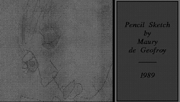
Probably the oldest drawing ever recorded as drawn by me. I believe it was scanned with one of those old hand scanners, thus the grain and faded quality of the image. My mom put the little note on the side with the credit and the date. 1989. I was born in 1981.

As My mother puts it:

Maury sketched this profile in pencil on a piece of lined paper when he was 7 or 8 years old. I told him it reminded me of a Picasso. In later years, when it was mentioned, he said he did if of his brother Alex’s face/profile, who was sitting nearby. It’s instructive, if not illuminating, when reconstruction/reinventing one’s personal childhood history (as we all do), to have one’s own point of view but also that of one’s parents.

I was a little bit off, comparing the “Seed Divorced” to this image. For whatever reason I had always seen the old picture in my head as looking something like that one, but it’s less similar than I remembered. Regardless, I was glad that my mom drew my attention to it, it was good to make that comparison, and be reminded of what it really looked like. Thanks mom.

Aequinox Vintage Clothing: Stockholm Edition

Sunday, March 22nd, 2009

The next biggest news out of Stockholm since the Pirate Bay Trial is that Aequinox Vintage Clothing of Oak Bluffs is doing a trade show there (okay, maybe not the biggest, but big okay?)

Saturday, with Sarah Goodhart’s guidance, I designed a card advertising her upcoming web store. (With Swedish Babelfish) It was a quick design, but in crowd tests it was received by the ladies as “very cute!” A success if I ever had one! Good luck in Sweden, Sarah.

Link: Article about the show

Older Work Part 6: Sharps & Flats

Saturday, March 21st, 2009

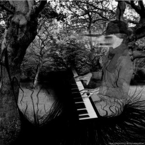
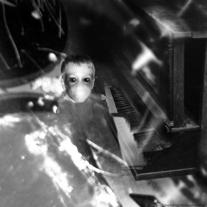
These two nightmarish images were created for a 2 disc mix cd a few years back. There was no real reason for the mix except that I wanted to make one (usually the incentive is something like “impress a girl!” or “make my friends like this music by force!”) I tossed this together with a theme, as one might be able to tell from the artwork: Piano music. Not exclusively pianos, but every song on both discs featured a piano in some form or another. I know, that’s not hard to pull off, but I thought it was a nice effort. A lot of the music turned out to be spooky and weird, so I put together the spookiest, weirdest covers I could think of.

The cover to Nurse With Wound’s “Thunder Perfect Mind” had been stuck in my head, and the “Sharps” cover (top image) took heavy influence from that image. I compiled these elements in Photoshop and took used my wacom tablet to draw the “branches” gripping her hands, growing as her seat, and so on.

The other (bottom image) was derived, I believe, from some sort of nightmare I’d had a few nights prior. The shiny blurry bits that seem to fly toward the front of the image and fade behind the kid playing piano are actually CDs. My CD collection had been damaged in a recent beach-sand accident and one day I decided to dig through them and pull out all the ones that weren’t worth saving, systematically snapping them in half and throwing them in a trash can. Rather than throw them out, I thought, on this hot autumn day in Savannah, it might be interesting to solder them together into a collage. I took out a soldering iron and found that when I held 2 CDs next to each other and punched through them with the hot iron, they stuck together almost immediately. Awesome! I proceeded to make a canvas out of CDs, with the intent of later sticking on a bunch of different colored ones in a way that made an image. I snapped some pictures, one of which was used for this image, and then put the thing against my wall. Unfortunately, it proved too fragile when returning home from work the next day, closing the door behind me caused it to crumble apart before my eyes. Oh well. They ended up in the dumpster moments later. Such is life. At least they made it into SOME sort of artwork.


Older Work Part 5: The Seed Divorced

Thursday, March 19th, 2009

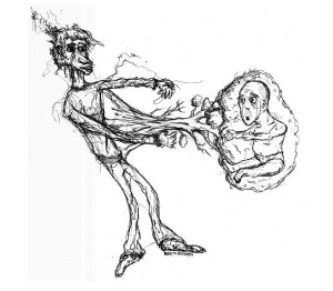
This was drawn in the midst of a panic attack, and it shows a certain amount of mania, I think. Lots of squiggly lines and tangential oddity, very short attention span. The baby looks sort of ridiculous, there are a lot of things I still, to be honest, don’t know how to draw, but that’s okay. My personal interpretation of this image is that it’s about a bit of a father and son disconnect. In Savannah I had little contact with either of my parents for years, and I had reconnected with my mother when I drew this, but my father was still out there in the unknown.

My dad also used to be notorious for drawing trees. Big elaborate trees with no leaves, just a bunch of scraggly tiny branches. It must have been some sort of meditation for him. I never got into tht, but I did a sort of cartoon tree growing from the belly of this skinny beast.

The man in this image strongly resembles my oldest known childhood drawing, which my mother insisted was very much like a Picasso. I was never so sure about that, but it was flattering.

Older Work Part 4: Breaking the Water

Tuesday, March 17th, 2009

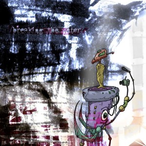
The cover to a mix CD I made for a girlfriend, back in… 2002? I think? The “Breaking the Water” reference was to a misnomer in speech I made while speaking to her, I meant to say “break the ice” and I said “break the water” – which is just silly.

The paint background was from a scanned in disposable palette. The detailing on the letters was some of my first work with a wacom tablet, same with the color on the little guy. I love that thing (although I haven’t made use of it in awhile, I think I’m going to use it for some retouching on this site.

Again, I was sort of ripping off the “Zim” style at the time but I am still fairly happy with the way this piece looks.

How to identify me on the street.

Sunday, March 15th, 2009

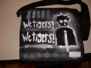
This is my “messenger bag” (otherwise known as a “man purse”). I spraypainted this one day with a stencil a while back. I don’t really know where the premise of the skeletal man with the tie came from, but I liked it and rolled with it. The text, completely unsuited, is “We Tigers” from the song by the same name, by Animal Collective.

On the street, people often ask what “Wetigers” is, pronouncing it “wet-ig-ers” – I suppose I could’ve spaced out the letters better. Oh well.

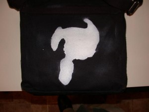
The back of the bag you may recognize from this website. It’s a “logo” I designed for myself back when I first started doing web design, in my game design days (eventually some of that stuff will be located here). People always ask me what it means, and quite frankly I have no idea. I basically just took a circle in photoshop and started splitting it into pieces until I came up with something that I liked. It stuck. It’s the only thing I’ve ever considered getting tattooed on myself, although I probably never will.

So, if you see someone walking around with this satchel, run up to them and start beating them over the head, because they stole it from me. Oh, uh, if you don’t know what I look like, hold back from that until you ask for my autograph. I’ll have lessons on how to properly identify a Maury de Geofroy signature soon.

news
art
web
radio