Older Work Part 3: Shakespearian Puke
Sunday, March 15th, 2009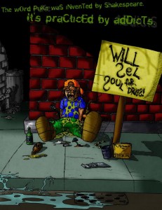 This image, created in… I think junior year of high school, was a comedic masterpiece, in the sense of the irony of the project versus my personal stance at the time. The intent was to compete at making an anti-drug “ad” for a local agency. The kids in the school would then vote on the project they thought was the best one. I tied with a film that had been created as a heart-string manipulating sob-fest for a kid who had died drunk driving the year before. The film was a pity-festival for the kid, who had driven drunk and gotten himself killed. I didn’t really understand what it had to do with discouraging drug use, it seemed like more of an effort to make a martyr out of someone who did something stupid. Anyway, I wasn’t terribly upset: I did tie, after all. The prize was 500 dollars which was split down the middle by the winners.
The irony comes into play when my standpoint on substances at the time (and relatively currently) comes into play: I didn’t see anything wrong with a little drug use and experimentation. I guess there’s a difference between that and addiction, but not in the eyes of the law, and not in the eyes of my teachers at the time. Also, I felt that it was funny, beause despire drawing a cartoon character sitting in a puddle of his own vomit, I felt that the stylized depictions of the drugs around him seemed to glorify drugs. I wasn’t a user myself, but there was something very comical to me about it all, because the people who came up to compliment me on my fine work often offered to get me high, or were high when they complimented me.
Of course, I knew this going in: the design was meant to appeal to the broader audience to win the vote, not to the anti-drug foundation it was actually being made for. I don’t know if it was ever printed or used anywhere beyond being hung in a piece of cheap posterboard in the hallway of the school. No, I didn’t buy any drugs with the 250 dollars, by the way.

