New Monkey on the Lam flier

Sunday, June 28th, 2009

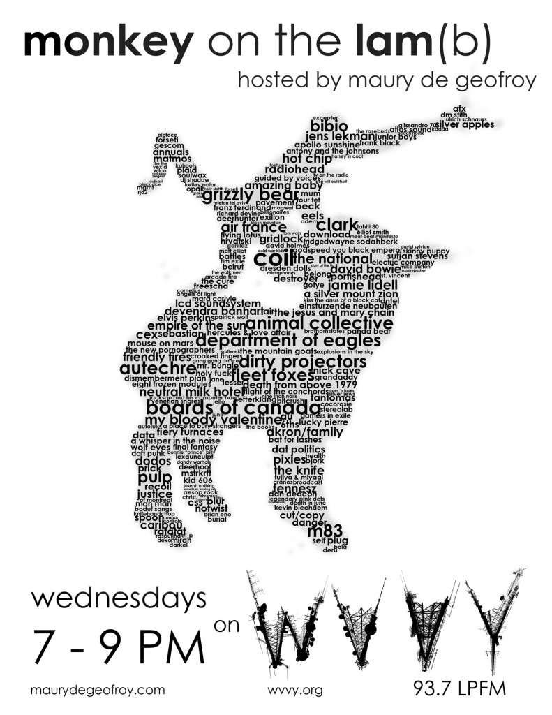
As I am (usually) a man of my word, I followed through with the design I’d been floating in my head. Overall it came out about how I wanted it to:
motl-bands-flyer

(click for a larger version)

If you like, you can also download the PDF in 300 dpi at 8.5 x 11 for printing.

I’m going to see how it looks on paper tomorrow, I hope it looks okay at 8.5 x 11, otherwise I might scale it to 11 x 17 (fortunately since it’s all font work, it’s easily scalable).

The design was inspired by a combination of elements. First: Chris, another DJ, has a flier for his show with a huge list of bands he plays on it, and I had always seen it and thought “I should display that kind of information somehow!” Second: there was a recent collection of grammy awards artwork that created portraits of band members with the song titles of some of the music that influenced them. It was neat, but the colors were fruity and it used a bunch of ugly fonts that just didn’t do it for me. I took the concept and did a “portrait” of my existing logo made entirely of band names. When all was said and done, it lacked a tiny bit of cohesion without the original tracing image behind it, so i lowered the opacity way down, blurred it out a bit, and left it in the background, for the trace of the original logo, to keep it more easily recognizable.

The general rule was that my favorite bands got larger billing, but in the end that occasionally went out the window, as I found myself remembering certain bands way after the fact and putting them in as an afterthought, not really wanting to rearrange the entire composition to fit them in. Still, most of the bands I like are here, although I overlooked a massive portion of my collection. Oh yeah, and I don’t think I repeated any names, I challenge you to find any (or a typo: hint – “zeigeist” is not a typo).

One more fun fact: there are 240 artists in the image. Those were hand selected (and hand typed, phew) from over 1300 or so artists in my collection.

I’ll probably find out tomorrow that there’s some kind of program that could’ve automated this process for me. Anyway… yay for wanking off on a sunday!

Another year, another WVVY logo design

Wednesday, June 10th, 2009

Minor changes may yet be made but I’m pretty satisfied, it shows up well at a distance, too.

wvvytowerssmall

(Click image for bigger version)

I figured the catch phrase could be something like “If only we had this many antennas, then maybe you could hear us!” or is that self defeating?

On that subject: my fill in from Chris’ show this week will be available soon, and a snippet of Wolfie’s show yesterday. Damn recording software bugged out on me so I was only able to get the last quarter of his show, sorry Wolfie.

The Friendly Nightmare

Saturday, May 23rd, 2009

If you live in New England, and perhaps elsewhere, I haven’t tracked their proliferation, you may be aware of a franchise restaurant chain called “Friendly’s” I guess it’s pluralized because someone named Friendly owns it? Regardless, it’s your standard American fare: Burgers, Ice cream, old people, young children and middle aged rampantly obese people. As a child, I loved friendly’s, I wanted to go there every time I went “off island” and I constantly jonesed for their burgers and reese’s peanut butter cup sundaes. In my adult life I’ve tried to resist it, but occasionally the nostalgic urge comes over me and I make the stop, devouring a nice big ball of greasy food and saccharine sweetness. Yesterday on the way to Umass for my brother’s graduation, my mother and I stopped in at one to grab a bite on the road. After using the restroom, I stepped out into the hallway and was met with a horrific site, pictured below:

img_0429

How would people get to work? What monstrosity is this? As a child I had fantasized about the book “cloudy with a chance of meatballs” coming true but this was a nightmare in front of my eyes. Upon looking more closely around the restaurant, several such horrors were present: churches with ice cream cones towering behind them, A town hall dwarfed by a grilled cheese sandwich. Good god, it was terrifying. Imagine your town, crushed by several pounds of meat and dairy, all cooked in lard. These poor people. I had to save them. I sprinted out the door to the nearest Walmart and gathered up supplies: Mr. Clean, a mop, and as many trash bags as I could carry. I sprinted toward the bridge waving the mop blindly in front of my face, like an amateur jouster, afraid to be hit and knocked from my horse. I swatted at the burger wildly with the wet end of the mop, trying to ignore the screams and whines of the bacon as the grease cutter sliced through it. The bun knocked me over a few times, but after an epic battle, the burger collapsed to the ground, defeated in a puddle of it’s own juices and melted cheese. I begrudgingly collected up the remains of the hideous beast, grease ruining my clothing, and dumped it into the trash bag.

Triumphant, I carried on. I stopped at a salon and borrowed 2 blow dryers that I then wielded like 6 shooters as I approached the ice cream cone. It attempted to drip into my mouth, but I resisted it’s temptations and fired upon it with impunity until it was nothing but a pink sticky mess on the pavement behind the town hall. Just then I heard a distant rumbling and a few moments later, the hill to the north was shadowed by onion rings, rolling downward toward me. I knew I was outmatched. As they crushed cars and knocked fire hydrants out of the sidewalk, sending jetstreams of water into the air. I retreated, meeting once again with my mother and shouting at her to start the car, drive, drive, before we’re all killed! We drove up the next hill and the onion rings lost momentum, collapsing upon themselves in greasy breaded messes. On the horizon I could see the french fries bursting from the pavement like fast growing trees, then crawling down the street as if they were caterpillars, eating the greenery as they went. These poor people. I did my best to save them, but I was overwhelmed, the food was too much, too prolific, too delicious and fattening. This poor town, off an exit in western Massachusetts, would have to fight this behemoth on their own. Good luck, brave souls.

And now, I’m off to watch my brother graduate.

Older Work 10: Plague of Love

Friday, April 10th, 2009

Plague of Love PosterI added a couple quick photoshops that I created for my friend Matt a while back to the art section (one of them was already there, but I decided to throw the supplement in alongside it). These were for a film audition that never became an actual film, but we had some fun shooting in Richard Lee’s house anyway. It was intended to be about questioning sanity, and I played an insane person.

I really got into the role and the lines between fun and reality became crossed and confused, most of the action was improvised on the spot with very little rehearsal and until “cut” was shouted I found myself wondering if everyone had really gone off the deep end. I also had a scene in which I was thrown out of a moving car. It was shot 3 times and I got my leg caught in a cable. Matt, if you read this, I’d love the raw footage some time, if any of it is still sitting around somewhere. Actually, it might be too horrifying to watch.

Plague of Love Poster 2I designed these images to be as sexy as possible for the purpose of drawing people to the bodies, then placing the rats on the head, a bit like the Windowlicker artwork, it becomes disturbing if looked at for more than a quick glance.

Art Section Added

Monday, April 6th, 2009

GalleryIt’s still a work in progress, and I need to tweak some visual elements, add more images, categories, and various other details, but thanks to the glory of WordPress and the wonderful NextGen gallery plugin created by Alex Rabe I’ve easily integrated a gallery into the art section. Go check it out.

Map Animals

Monday, April 6th, 2009

ruwn4ymjbkntmtb84dhppdkeo1_500jpg-480x631

Also found on noquedanblogs – there is a lot of neat looking stuff over there.

Google Classic

Monday, April 6th, 2009

google

Saw this on Boing Boing Gadgets the other day. Traced back to this blog, that I wish was in English

Aequinox in Manhattan

Saturday, April 4th, 2009

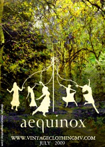
maypolefinal-smallDesign for the Aequinox advertisement at Manhattan Vintage on April 24th and 25th.

I took some hefty influence from the Silhouette Masterpiece Theatre designs, of which I recently purchased a print. The elements and juxtaposition on this particular piece are of my own doing, however, with some specific tweaks and guidance from Sarah.

If you’re in Manhattan on April 24th, stop by the show and buy some clothes. I’ll be there as well, looking out of place and very likely rather disheveled in contrast with the other attendees.

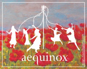
maypole-card-small

Edit: Made some modifications, and created a second image. The second was done tonight, this is for the mailing cards.

Older Work Part 8: Batman In Classic Art From Something Awful

Sunday, March 29th, 2009

mcpenguinThese couple images, along with many others in the same Somethingawful.com thread, spread relatively wide on the internet, becoming front page features on the aforementioned site, and having their image tags scraped off them to be posted by plagiarists on various other web pages. My username on those forums was caldrax and I posted several photoshops there, ranging between sloppy and funny, very authentic looking and unfunny, and sloppy and unfunny. These were a couple of the more technically adept ones, though the hilarity factor was low. I also did several potentially offensive ones, which may or may not be shared here, depending on how much I decide I care for my reputation.

The first image was the famed M.C. Escher, retouched to look like the Penguin. It was surprisingly easy to do, I simply cut and pasted in the Penguin’s face and layered on the texture used in the rest of the image to make it fit in. The source photo of the penguin already had a look of bulbousness about it, so I didn’t need to do any reshaping to match the spherical nature of the rest of the Escher image. It came out looking like it had been harder to create than it had, which is always nice.

magrittarangThe second image was harder to achieve, yet not as widely found to be amusing (Isn’t that always how it goes). Color is always trickier, and a lot of layering, clone tool, and various forms of trickery were used. Removing the old gigantic comb from the original Magritte (this may not be the exact image I used-there were several reproduction versions) proved to be the most difficult part, and placing the shadow was equally tricky. I was proud of the way that part ended up looking, and the wall behind it came out pretty nice as well. I must confess, however, that I was frustrated at being unable to find a batarang that looked exactly like what I was going for.

The thread inspired some really great photoshops (and some not so great ones), I recommend looking over the highlights that were later posted on Somethingawful.

Wolfie’s Strange Ways in 4D show on WVVY – Recorded live at 1PM this afternoon

Wednesday, March 25th, 2009

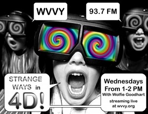
Wolfie is 13 and goes to the Public Charter School on Martha’s Vineyard (oh hey, that’s him right there on the front page), and he does a rockin radio show on WVVY on Wednesdays at 1 PM for an hour. I’ve been recording his episodes, you can check out past ones in the Radio section. Today I had a scare, thinking the station was going to be down, but I slyly found a stream and was able to get it recorded. Here it is. 128kbps MP3 this time:

Wolfie – Strange Ways in 4D March 25th 2009

[audio:http://www.maurydegeofroy.com/Radio/Wolfie-SW4D-03-25-09.mp3]
news
art
web
radio