April 8th, 2009 10:08 pm
 Here’s Wolfie’s latest, and I think greatest episode of his radio show, Strange Ways in 4D, yet. He played a ton of new music, much of which was new to me as well, and his radio presence was dynamic and funny. I got turned on to a few bands I’d never heard from this episode, and for me that’s a rarity. Listen to it.
96kbps MP3 – About 1 Hour long
[audio:http://www.maurydegeofroy.com/Radio/Wolfie-SW4D-04-08-09.mp3]
And check out my show tomorrow night at 8 on WVVY – the stream is working again now, so I’ll be interacting live on twitter, facebook, and other avenues.
Posted in Event, Friends, Link, Local, Music, Radio | No Comments »
April 6th, 2009 8:49 pm
 It’s still a work in progress, and I need to tweak some visual elements, add more images, categories, and various other details, but thanks to the glory of WordPress and the wonderful NextGen gallery plugin created by Alex Rabe I’ve easily integrated a gallery into the art section. Go check it out.
Posted in Art, Link, News, Photo, Photoshop, Web | No Comments »
April 6th, 2009 11:04 am
This was always my favorite ever strip of Calvin and Hobbes, it still makes me burst out laughing. Found it playing with stumbleupon.

Posted in Art, Found, Humor | No Comments »
April 6th, 2009 9:43 am

Also found on noquedanblogs – there is a lot of neat looking stuff over there.
Posted in Art, Found, Link, Photoshop | No Comments »
April 6th, 2009 9:40 am

Saw this on Boing Boing Gadgets the other day. Traced back to this blog, that I wish was in English
Posted in Art, Found, Humor, Link, Photoshop, Tech, Web | No Comments »
April 6th, 2009 9:03 am
 Sarah found this old copyright image when she was looking for public domain pictures online the other day and she sent it to me. I thought it was quite amusing.
(Note: my page says copyright on the bottom but when I get some time I’m going to classify it under creative commons – just need to find precisely the right category – suggestions in that department are welcome, feel free to leave a comment).
Posted in Copyfight, Found, Humor | No Comments »
April 4th, 2009 8:28 am
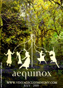
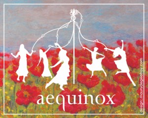
 Design for the Aequinox advertisement at Manhattan Vintage on April 24th and 25th.
I took some hefty influence from the Silhouette Masterpiece Theatre designs, of which I recently purchased a print. The elements and juxtaposition on this particular piece are of my own doing, however, with some specific tweaks and guidance from Sarah.
If you’re in Manhattan on April 24th, stop by the show and buy some clothes. I’ll be there as well, looking out of place and very likely rather disheveled in contrast with the other attendees.

Edit: Made some modifications, and created a second image. The second was done tonight, this is for the mailing cards.
Posted in Art, Event, Friends, Link, Local, News, Photoshop | No Comments »
April 2nd, 2009 9:08 pm
 This is actually photoshopped. Ever so slightly. I drew this girl and I drew a pair of binoculars, they were not positioned as they are here. I saw them on the page next to each other and didn’t understand why I hadn’t drawn her looking at the binoculars. So I moved them with the power of the computer. I am a cheating hack.
There is no great story behind this image, it’s just something I drew in Savannah one day and thought there was something mysterious and interesting about it, enough to keep it around. I imagine that she is holding herself back, resisting the urge to pick up the binoculars, but she’s just about to crack and lift them to her face, and in the distance is something she knows she shouldn’t look at, something private and taboo, but she just can’t help herself.
Or birds. She could be planning to look at birds.
Posted in Art | No Comments »
April 1st, 2009 2:22 pm
 It’s true. I work in one of them. Dry towns, they’re called, for the uninitiated. These are places that never got around to repealing prohibition and now contain just enough votes against change to hold back the rest of the public from ordering a nice glass of wine with dinner. Why? It will destroy the community, of course!
Well, there is another side of the community that suffers from this mindset: the local business owners. And all the people who want to order a glass of wine and didn’t realize they had to bring their own. Oh yeah, and anyone who is in favor of forward progress.
Okay, Maybe I’m a bit biased.
I was commissioned, through EduComp, for the cause – to design a website to showcase the language of those working toward legislation that would allow beer and wine consumption at restaurants in one such town: Tisbury, otherwise known as Vineyard Haven, Massachusetts.
I should note that personally, I drink very little, perhaps one or two beers or a glass of wine in a month, although, like many, I went through a typical teenage binge phase. I blame the heat and madenning peer pressure of Savannah, Georgia. That’s beside the point, however: the legislation would be good for the town. As it stands, people can bring their own beer or wine to dinner, so the drunks are just as able to get drunk. If anything, this would be more regulatory, and it provides those who want to have a drink at a restaurant that option. I have had a lot of trouble understanding the logic behind the fight against it, aside from stubborn traditionalism.
Consider this a call to anyone who lives in Tisbury: please vote on this on April 14th. It’s a town meeting vote to get it on the ballot in 2010. It needs your help to pass. For more information, and some words from those involved in attempting to pass the legislation, visit the site itself: PreservingTisburysFuture.com
I will have a more comprehensive post in the web section about the process of the design of the site soon, and about upcoming websites, when they go live.
Posted in Event, Friends, Link, Local, News, Rant, Web | 3 Comments »
March 29th, 2009 9:40 am
 These couple images, along with many others in the same Somethingawful.com thread, spread relatively wide on the internet, becoming front page features on the aforementioned site, and having their image tags scraped off them to be posted by plagiarists on various other web pages. My username on those forums was caldrax and I posted several photoshops there, ranging between sloppy and funny, very authentic looking and unfunny, and sloppy and unfunny. These were a couple of the more technically adept ones, though the hilarity factor was low. I also did several potentially offensive ones, which may or may not be shared here, depending on how much I decide I care for my reputation.
The first image was the famed M.C. Escher, retouched to look like the Penguin. It was surprisingly easy to do, I simply cut and pasted in the Penguin’s face and layered on the texture used in the rest of the image to make it fit in. The source photo of the penguin already had a look of bulbousness about it, so I didn’t need to do any reshaping to match the spherical nature of the rest of the Escher image. It came out looking like it had been harder to create than it had, which is always nice.
 The second image was harder to achieve, yet not as widely found to be amusing (Isn’t that always how it goes). Color is always trickier, and a lot of layering, clone tool, and various forms of trickery were used. Removing the old gigantic comb from the original Magritte (this may not be the exact image I used-there were several reproduction versions) proved to be the most difficult part, and placing the shadow was equally tricky. I was proud of the way that part ended up looking, and the wall behind it came out pretty nice as well. I must confess, however, that I was frustrated at being unable to find a batarang that looked exactly like what I was going for.
The thread inspired some really great photoshops (and some not so great ones), I recommend looking over the highlights that were later posted on Somethingawful.
Posted in Art, Link, Photoshop | No Comments »
 Here’s Wolfie’s latest, and I think greatest episode of his radio show, Strange Ways in 4D, yet. He played a ton of new music, much of which was new to me as well, and his radio presence was dynamic and funny. I got turned on to a few bands I’d never heard from this episode, and for me that’s a rarity. Listen to it.


